Intro
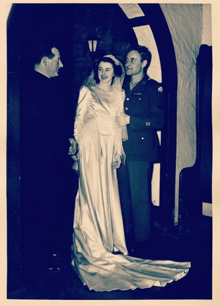
How did our young, handsome grandparents spend money back in 1950 and how do we spend it today?
In real terms, our quality of life as Americans is much better today than it was in the past (but maybe not for much longer?). Goods and services are cheaper than ever (such as flights), and salaries are higher too. While these trends might not continue, I thought it would be fun to compare how someone from 1950 would spend their money today.
Going into this project, my guess was that people from 1950 would be able to save a lot more money than we do today. This turned out to be true.
If the average American adopted spending habits from 1950, their savings rate would be 5 times higher, at almost 20% ($75,000+ every 10 years)!
As we know, however, most Americans haven’t pocketed productivity and/or salary gains over the last 60 years. Instead, we have inflated our lifestyles to accommodate all the extra cash floating around.
Lifestyle inflation
Lifestyle inflation is what happens when someone gets a raise and instead of continuing to live the exact same life, they decide to live larger. Instead of diverting the extra, hard-earned money to savings accounts, they might use the money to travel more, move into a nicer house, buy a cooler vehicle, etc.
I know first-hand how hard it can be to avoid lifestyle inflation. It happened to me in my career as I got more comfortable with large restaurant bills, fancier neighborhoods, and nicer apartments, amongst other things.

Lifestyle inflation is a hard beast to tame, and it seems to be getting harder over time. Juliet Schor does great job explaining the challenge of lifestyle inflation in her 1993 book, The Overspent American, the first chapter of which is available free here.
The Overspent American
One of Schor’s main premises is that we, as social animals, have a tendency to try to keep up with our peers and sometimes even outperform them in life because it gives us a warm fuzzy feeling (and helps ward off feelings of inadequacy).
In the past, she says, our peer reference group was smaller and more closely aligned with our own demographic. Today, however, not only are we more intimately exposed to people from outside our own demographic (social media, TV, celebrities, advertisements), but these people are also more widely distributed along the income / wealth spectrum. In other words, our reference groups have grown much larger and more diverse.
What happens as a result is that we spend more (and save less) simply to maintain our status in these larger, more diverse reference groups. Basically, we spend more to avoid feeling like a chump.
Ironically, the desire to keep up with the Joneses and avoid feeling like a chump actually makes us more chump-like in the end. We get stuck working longer careers, spending more money, and sacrificing valuable free time simply to pay the credit card bill at the end of the month… a raw deal if you ask me.
So anyway, that is the background to the information below and a big part of the reason I wanted to look at how people managed to live in 1950 with substantially less buying power.
How people from 1950 would live today
In the past, it was believed that increases in American productivity (robotics, assembly lines, etc.) would lead to increased leisure time and maybe even a 4-day workweek. Sadly, this never came to fruition. The reason, as I’ve discussed above, is that Americans decided to spend all their extra money on stuff instead of pocketing the spare change.
Granted, some of that extra money might have actually added more value to our lives than we lost by spending it (I’m thinking about technology here), but a lot of it probably didn’t really add too much incremental value.
Below are a few charts showing where our appetites for spending have grown the most.
First, let’s start with median incomes:
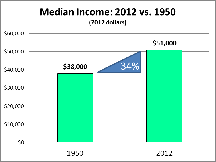
As you can see, median incomes were almost 34% lower in 1950, at $38,000! We’ve made real gains since then with 2012 median incomes of about $51,000. This represents an additional $13,000 dollars of real income over the past 60 years, most of which has been allocated to additional goods and services, a classic case of lifestyle inflation!
So you’re probably thinking, “well, what kind of things exactly did we spend our $13,000 raise on?” The chart below addresses that question:
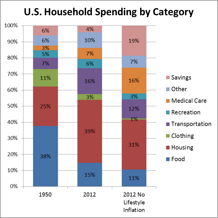
The first thing that jumps out here is how much less we spend on food today. Productivity gains and (I think) increased trade have helped food become much cheaper relative to income since 1950. But even though we spend a smaller percentage of our incomes on food today you can see that, comparing the 2012 (actual) and 2012 No Lifestyle Inflation columns, if we really wanted to live like someone from 1950, we would be able cut out even more from our food budget.
Another good that has become significantly cheaper over the last 60 years is clothing. Clothing was the third most expensive category for most people in 1950, but today it is actually the least expensive, accounting for just 3% of total spending. Similar to food, we have decreased our spending, but not enough to keep up with the lower costs of production. Clothing expenses could theoretically be as low as 1% and we’d still have the same buying power as people from 1950.

Outside of food, the two most important categories of spending for most people are transportation and housing. Housing’s share of total spending has grown 56% since 1950. Even though costs have grown pretty quickly since then, our spending has grown twice as fast. Couple this with the fact that the average mortgage maturity was 14 years in 1950 versus roughly double that in 2012 and it quickly becomes apparent that housing is one of the areas where our appetites have grown the most.
Transportation also occupies a larger share of expenses today, which is to be expected. Larger cities and suburban sprawl require increased transportation spending, but again, not as much as we are actually spending today. Similar to housing, I would guess that auto financing was also much more conservative back in the day, which means that the 2012 vs. 1950 comparison is probably a little understated as well.
Here a look at 2012 absolute spending levels with and without lifestyle inflation (since 1950):
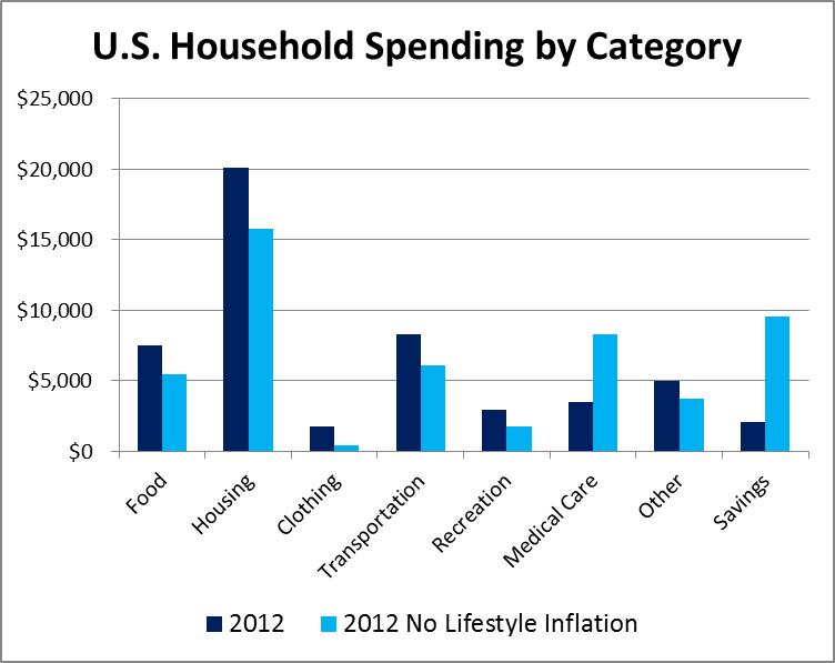
This chart is helpful to show where the actual dollars went. Housing, transportation, and food represent the largest differences, and as mentioned above, housing and transportation are likely very much understated due to increased home and auto financing leverage.
This chart makes it a little easier to compare absolute differences for the typical American:
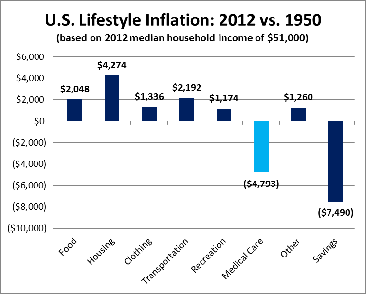
Excepting medical care, expenses grew across the board. As a result savings were $7,500 less than they would have been without lifestyle inflation. To put that in perspective, $7,500 of extra savings each year is equivalent to almost one whole day off per week for the average American. So the utopian dream of a 4-day work week really would have been (and still is) attainable for those that chose to spend money like people did in 1950.
Recognizing that not everyone makes exactly $51,000, the chart below shows what percentage changes the typical American would have to make to remove the effects of lifestyle inflation:
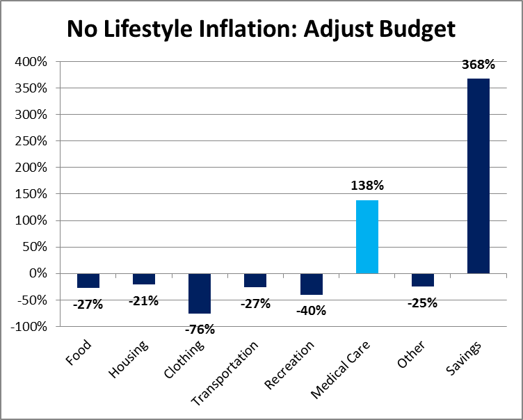
These percentages can be used to help anyone live more like your young, handsome grandparents. Of course this is more of a directional exercise, but if you have a sense of your spending in comparison to the general public, you can use this as a tool to prioritize certain areas of your budget or simply to recognize and critically assess the things that the general public says you should spend money on.
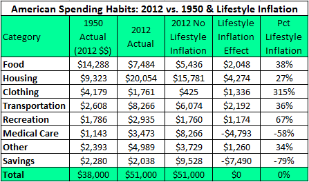
For example, the typical American household could theoretically reduce their yearly clothing budget by 76%, from $1,700 to $425 if they wanted to live like people did back in the day. And just so the curious readers don’t have to back into the numbers, here is the data table I’m sourcing most of my charts from:
Putting it all together
I can hear a few skeptical murmurs in the background, so I want to make one thing clear. I’m not suggesting that people should spend in exactly the same proportions as everyone did in 1950. Needs change; I get that.
Our grandparents didn’t have smartphones, and they also weren’t aware that meat, potatoes, and canned goods didn’t exactly constitute a healthy diet. Heck, they barely even knew that cigarettes caused cancer.
On the other hand, things like housing haven’t really changed much since 1950. At the end of the day, a house is still mainly a shelter, a place to lay your head on a pillow. Granted, cities have become denser and housing prices have increased a bit, but the main function of, say, housing (or clothing) hasn’t really changed that much over the years. What has happened instead is that we’ve decided to take our collective 34% pay raise and spend it on things like marble countertops and $100 jeans.
Another thing I want to point out is that spending like people did in 1950 doesn’t actually mean buying products like this:
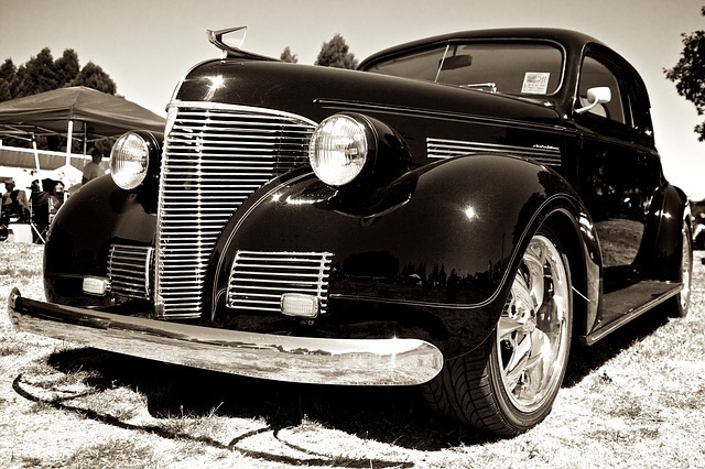
It means spending $6,000 per year instead of $8,000. It means buying gently used Hondas instead of new Acuras. And let’s face it; making that kind of switch isn’t really much of a sacrifice.
So anyway, hopefully this was as fun for you as it was for me. My big takeaway is that if you want to save more money, retire earlier, and/or work less, then you should spend closer to how your grandparents spent their money back in the day. This means cutting about 20% out of your budget for the typical American, and especially focusing on some of the bigger expenses like housing and transportation. As my good friend says, “less is always more.”
On top of that, it also seems like a good idea to be critically aware of lifestyle inflation pressures. Idle hands (or idle raises) are the devil’s play things. Put those raises (and macroeconomic productivity gains) to good use before Instagram #vacation envy gets the best of you!
Methodology
The spending percentages come straight from this NPR piece, What America Buys. Using 2012 median household income from the U.S. Census Bureau and savings rate data from Credit Writedowns, I backed into the actual dollar amounts for 2012. I repeated the process for 1950 using median household income from Stanford.
From there, I converted the nominal 1950 median household income into 2012 dollars using this inflation calculator. Then I inflated each individual spending category according to its unique price growth trajectory using CPI data from the U.S. Bureau of Labor and Statistics. Finally, leftover 2012 dollars were allocated to savings ($7,500) for the no lifestyle inflation scenario.
It should be noted that a few of the smaller categories didn’t have data sets that went all the way back to 1950. For those, I had to substitute overall CPI data for a few years instead.
And that’s it… thanks for visiting!